
![]()
Just the other day we were wondering what the hell was happening with the promotion of Artsfest this year. Turns out there is a campaign but it was all kept under wraps until last night when Feel The Heat was launched at the Jam House. (I managed to blag an invite but my thoughts on this spectacular event will appear on my own blog as Created in Birmingham isn’t really the venue for such things.)
In essence Feel The Heat is a unified campaign from Birmingham Marketing to bring all the flag-pole arts events under one umbrella and to push a unified message both to the residents and the rest of the world. The main organisations involved are the CBSO, Birmingham Royal Ballet, NEC, The Rep, Gigbeth, Artsfest, Fierce – those sorts of things. It’s not a bad idea and something that came up in the Why can’t Birmingham do it like Manchester debate in July. Birmingham has produced a large number of fantastic events from the grass roots and it’s the council’s job to tie it all up in a package which says “this is Birmingham”.
The big question, of course, is whether this attempt is a success. Here are a few of the generic adverts.
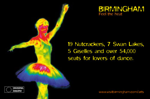
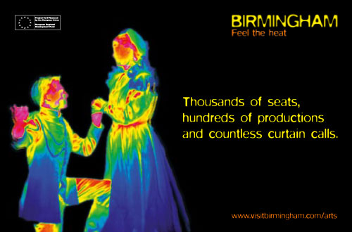
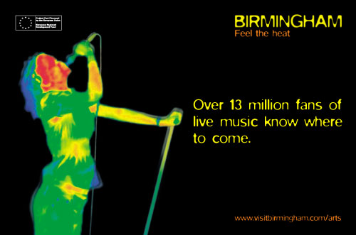
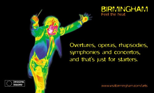
If you keep an eye on bus shelters you’ll spot the current one for Artsfest which, I noted, de-emphasises any existing branding in favour of the “thermal” imagery.
The “campaign imagery, identity, logo and graphic treatment” was done by the Birmingham branch of McCan Erikson. The font, if you’re interested in such things is Neville Brody‘s 1992 font Blur.
So what do you think?
(Given that this project appears to have been tied up in an unhealthy amount of gagging orders I should add that you can comment here anonymously – just use a fake name and email.)
I think it stinks to be honest. There’s something strangely cold about heat maps anyway but the way they’re used here on the black background is particularly dour.
The copy is as bad. Listing facts, figures and achievements impresses no-one, it’s the same generic campaign used by loads of cities. ‘Thousands of seats, hundreds of productions and countless curtain calls’ – it’s hard to believe McCann Erikson spent too long crafting that sentence.
There’s nothing about this that says Birmingham to me.
And isn’t ‘Feel the heat’ a strange tagline for a campaign starting in Autumn?
Hate it. Branding-wise at least.
Billy’s right about the black background – the heatmaps won’t work anywhere but on black – nor in monochrome. Black backgrounds will look terrible on newsprint or anything not glossy.
The font isn’t very clear – especially not when it isn’t in colours that contrast strongly.
It says nothing about Birmingham – and to nothing to me about my life. It seems geared to promote things that are doing quite well by themselves.
The brand is short lived almost by definition, one two years tops(?).
Why is branding seen as the solution to bloody everything?
And if doing it really delayed the proper launch of artsfest to a fortnight before then it’s a really stupid decision – creating your own deadline that messes you about?
Excellent! More! More!
Got my copy of the artsfest brochure in the post today and instantly hated it. Really depressing rubbish. I would have much preferred them to re-use last years imagery and use the time and money saved for something else.
I was just wondering what was happening with the brochures. Thanks for the heads up.
“And isn’t ‘Feel the heat’ a strange tagline for a campaign starting in Autumn?”
And isn’t ‘Feel the heat’ a strange tagline for a campaign promoting a city in the UK that’s usually cold and wet?
Style over substance!
It’s almost on a par with the Wolff Olins Olympic logo. Though black can be striking in the right circumstance here it looks oppressive and ‘cold’, as previously mentioned.
There is only one level to this campaign and it does little to capture the imagination, or the essence of Birmingham. Marketing Birmingham never seem to learn from their mistakes, missing opportunity after opportunity to extol the virtues of Birmingham through great design.
The only ‘heat’ felt is surely from the backlash to an inappropriate treatment. Sorry, but this does little to raise my body temperature…
“In essence Feel The Heat is a unified campaign from Birmingham Marketing to bring all the flag-pole arts events under one umbrella and to push a unified message both to the residents and the rest of the world.”
And therein is the problem. It is the curse of ‘joined up thinking’. The belief that if the message is unified it strengthens the whole and saves money. It’s rubbish. Birminghan didn’t get the ‘workshop of the world’ tag through a poster campaign, it simply became the workshop of the world and was therefore recognised as such. In the same way we’ll get recognised for having a diverse and amazing arts scene when we have one and not before. We need to let events speak for themselves so that there is a developing sense of vibrancy and diversity but marketing has a much smaller role to play than quality. In fact it is even more complicated than that. In the early 90s when the news was full of the scurge of drugs and guns on Moss Side it didn’t for one second stop us from thinking that Manchester was probably the hippest place on earth. What spoke was its music, its clubs, its football, its big old ugly industrial past. The guns and drugs simply added to its mystique. Actually hang on, that’s what this Birmingham campaign needs perhaps: not ‘feel the heat’ but ‘packing heat’.
(Apologies for going anon. I probably don’t need to but I work in the public sector and probably will do for quite some time so would hate to upset potential future employees)
Hideous. Shameful actually.
It is so incredibly inferior to Fluid’s (I think it was them?!) beautiful job for last year’s festival that I assumed this must’ve been an in-house job when I got the brochure through.
It looks terribly dated and, I agree, cold – not to mention soulless, static and samey (all the ‘s’s in fact …).
And this from the world’s largest ad agency … Oh, maybe it’s me? Maybe I’m missing the ‘big idea’? Perhaps we all are …
Yours, tearfully …
BirminghamDeservesBetter
To make things just that bit worse, take a look at the website:
http://www.visitbirmingham.com/arts
What a vile header … I feel poorly.
For some reason my last post didn’t seem to work …
I just wanted to add that the site (the address of which is at the foot of the posters) is pretty awful – look at that vile header. Or don’t if you value your eyes.
So sad. I feel poorly.
Just got hold of a copy of the brochure and it’s almost unreadable. Looks like an Excel Spreadsheet.
I wouldn’t confuse the whole branding thing with the ArtsFest brochure – I doubt the council budget stretches to 100-year old ad agencies. There’s a huge amount of info to get over about ArtsFest – what’s inexcusable to me is that the full listings aren’t online anywhere I can find.
Yep, not a very well-worded comment before. I was still reeling from shock that an (I’m guessing) very expensive and renowned ad agency (well, the London McCann’s is renowned, I’m not sure about Birmingham) had produced such an unappealing, unrepresentative and slapped-together look for the promotion of each and every Council-funded arts event.
I mean, how will they represent an exhibition of paintings do you suppose? A character wielding a larger-than-life cartoon-style paintbrush perhaps? Oh god. I’m just worried that Birmingham’s attempts to represent itself as a creative force are in danger of being undermined by hackneyed, almost laughable, concepts.
Forgetting for a moment what the campaign looks like (shudder), why the Dickins does Birmingham need this sort of ‘campaign’ anyway? Is it so that everyone’s fully aware how very many arts projects get funded by the Council?
I can just foresee any personality and individuality created to promote future arts events being drowned in a sea of invasive black backgrounds and frightening, gaudy figures. Yuck.
I have been contemplating whether the Council possibly found themselves ‘flattered’ into it by a well-known ad agency, desperate to get itself noticed by funded organisations, in order to get their mitts on their marketing budgets? I mean, what other campaign do you know of that has a page on its website crediting the company that came up with the ‘campaign imagery, identity, logo and graphic treatment’? Bizarre!
As Artsfest is probably the biggest (or perhaps second biggest after Fierce?) arts festival held in the city, the fact that there’s no online resource for all if its events, for me, underlines the fact that they’ve done a pretty half-arsed job with this.
It’s a shame as the city’s arts scene has got so much going for it. So, the question I’m left with is simply this: Why?
It seems to have started going out nationally, already. I just noticed an ad with this “branding” on the Guardian site…
I’m gonna say something really controversial here. I like it. Hope it works for the city.
Good God, something positive written on this site. Doubt it will be allowed.
PS worth noting Marketing Birmingham and the council are two entirely separate beings. If you’re going to slag someone at least get the name right.
Lee, positive comments are always welcome. I’d be interested to know what you like about it though. See if you can convert people!
As for Marketing Birmingham being “entirely separate” from the council I didnt realise this so thanks for clearing that up. Its very easy to conflate “the establishment” with “the council”. That said, from their about page it’s:
I should also add that I was talking to Neil Rami, Chief Executive of Marketing Birmingham, at the launch and he was a very interesting, intelligent and insightful man. I have no personal beef with them.
what do i like?
its thermal “done proper” and looks a 100% better than the recent carling ads.
Its obviously notcieable – after all we’re all talking about it whether good or bad i bet the publicity team’ll be loving it.
“PS worth noting Marketing Birmingham and the council are two entirely separate beings. If you’re going to slag someone at least get the name right.”
I don’t think anyone here has confused Marketing Birmingham and the council. I think they’ve slagged off the campaign itself and a couple of things the council themselves (artsfest programme, B1 CD) have done with it so far.
As for entirely separate : “A public-private partnership receiving financial support from Birmingham City Council” isn’t entirely separate at all – as the largest (and only named public) source of funding it’s a ‘partnership’.
Excuse me for going off topic here, but it’s this separation, quango-ism, outsourcing and consulting that’s modern capitalism’s masterstroke. Not only does it – on paper – “reduce risk” it has the charming side effect of reducing accountability and responsibility as almost every decision can be obstruficated and eventually put down as “a failure of communication”.
If a member of the public doesn’t like what Marketing Birmingham (for example, I could pick any number of NGOs) do (and very few know who they are) what’s the accountability structure?
“Its obviously notcieable” – we’ve only noticed it because it’s here where we read about Birmingham stuff, and we care about this kind of thing. We’re not the target market. In design there isn’t the catch all ‘any publicity is good publicity’ crap. Bad marketing and design will fail, and I’m sure the publicity team would rather there was unstinting praise and loads of Brum’s creative community clamouring to use it to promote their own works and events.
I also don’t think anyone here disagrees with the aims of the campaign, of course they “hope it works” – it’s just in their own (sometimes educated, sometimes professional, sometimes informed gut feeling) opinion don’t think it will do as well as it could or should.
calm down calm down
I love Birmingham.
I love how great the arts is in this fair city.
All I ask for is a campaign that shows this…
Even if they are going to use crap thermal imagery – the least they could do is use great images like the ones Fierce or others use (although I guess they wouldn’t want their lovely images ruined)…
I think the Artsfest branding and general communication is really poor. Feel The Heat? Seriously?
On a communication level, making sense of the catalogue is nigh on impossible with poor layout and typography. The content is equally as bad with very little information on who the performers are.
The branding is equally bad. Call me a design geek but that font got overused in the mid 90’s and really does not communicate a sense of style or innovation. In fact it really does feel very early 1990’s. Maybe that’s the next big trend… we’ve just had the 80’s after all.
Overall I do not feel inspired to come to the events.
I dread to think how much must have been spent on this. Not one of McCan Erikson’s finest.
It’s a bit late but here’s my two-penneth:
Personally, I’m not convinced by the campaign imagery/visual concept.
I do, however, think the general idea of a Birmingham arts calendar is a good one.
Strangely enough, I was pondering the concept of an all-of-Birmingham’s-arts-events-in-one-handy-place directory about a week before this campaign was launched. Honestly, I was! Must be something in the air …
Anyway, it makes perfect sense – it should help reduce that ‘When did that happen? I missed it!” thing, from which I tend to suffer, and also go some way to creating a wider awareness of quite what a varied and burgeoning creative community we have here in Birmingham.
I do wish the branding had been a bit more subtle (like a blank canvas for the events to be added to I suppose) – but I’m a designer and you know how much we like white space …!
Interesting piece in B Post media section today (Monday 17th) with Dave Hodgson – marketing director at Marketing Birmingham explaining the thinking behind the campaign and Simon Jones from the Custard Factory Spaces explaining why he doesn’t think it works.
September listings « Ian’s 7inch blog
[…] for assorted misgivings about Artsfest and Birmingham’s new ‘Feel the Heat’ campaign. http://www.createdinbirmingham.com/?p=618 […]